Kennedy's Kitchen - Branding
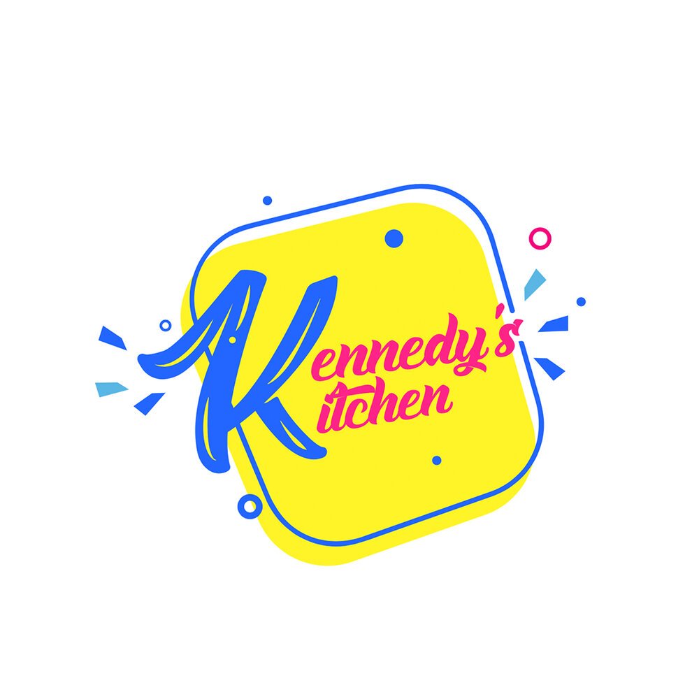
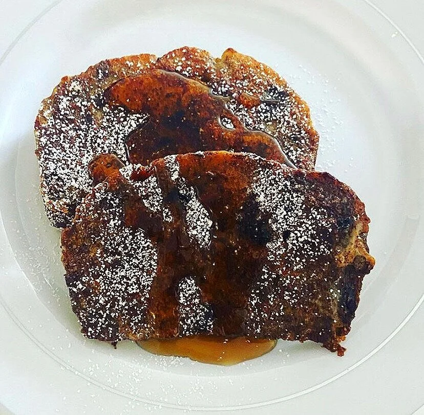
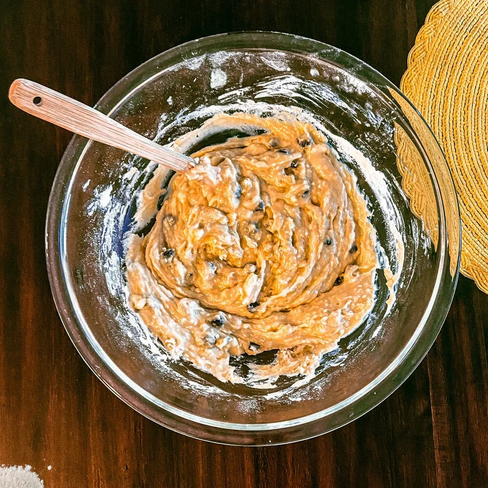
Kennedy’s Kitchen is a mother-and-daughter cooking company, primarily based on Instagram. The style they were going for was poppy, fun, vibrant yet timeless. My involvement in this was designing the logo as well as some product photography.
Color theory - Blue: Evoke the emotion of security, trust, and calm. Yellow: Generally used in food branding for its ability to induce feelings of hunger. Red: Shows energy and encourages the viewer to take some sort of action. Elements and structure - The square(s): Rounded edge square for structure. Square outside of the initial square for a more organic feel.Confetti: Burst of confetti and other shapes for excitement. The type- Curved, flowing rounded type to create the feeling of being handwritten. (Natural and organic)